I'm looking at some sample code for the iPhone, an application that demonstrates a bunch of principles in app coding all at once, including animation and so forth. It's a relatively trivial app, just sample code, and it uses the
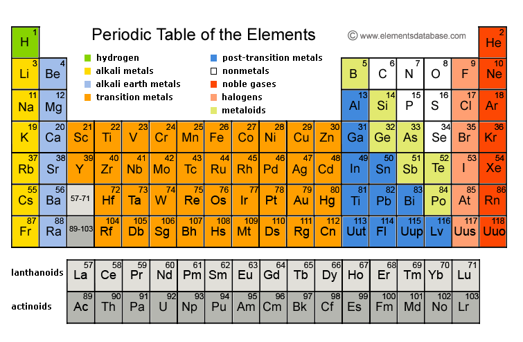
Periodic Table of Elements as its data set. As information goes, the PT is a pretty useful set of data. But then I recently came across
This t-shirt while reading Dinosaur Comics.
The information packed into this t-shirt space is REALLY USEFUL. It's probably the most concise and powerful set of scientific information I've seen, taking all the best discoveries of the last couple centuries and distilling it into a simple to use set of engineering instructions that people at nearly any technical level could understand (and experiment with) given a bit of time and energy.
When I was thinking about the Periodic Table and all the elements represented on it, it occurred to me that the names of the elements aren't really all that useful or descriptive, and the symbols themselves are actually confusing if one doesn't understand their origins (Pb for lead? Well, that's because it's "plumbum" from the Latin, because those clever Romans went and made all their pipes out of lead - lucky for them their water was mineral rich and mostly coated the pipes on the inside). I started wondering if it would be better to come up with a new kind of taxonomy for elements; and I guess when I say "better" I am discounting the whole "retrain generations of scientists in various disciplines to use another system" thing and wondering if there's a way to teach people a new system, or whether more people would learn more effectively if there were a better naming scheme and/or organization to the table.
I didn't give it too much thought because I didn't want to start going down a Dvorak or Esperanto type rathole. It's bad enough that people in this country are too dead set in their ways to use the freaking SI like the rest of the world does. But then I looked at the t-shirt text and started thinking about organic chemistry and how CHON is key for so many different applications - yet the PT doesn't really reflect that at all. Neither does it highlight all the various elements that are so key in electronics applications (and yes, I realize that engineering and pure science rarely mesh well, but I'm talking about practicality in everyday life and spreading useful knowledge to the maximum number of people, not about keeping information "pure").
In its current state, the PT is minimally useful and requires a significant amount of training to understand even the basics of it. So I have to ask: how would Edward Tufte recreate it? What visual cues would improve its information density and readability? What would a three-dimensional periodic table look like? Is there a way to name the various elements to better represent their properties - maybe even to make chemistry easier to understand (just as prefixes and suffixes in chemical names make it easier to envision what kinds of chemical or molecular properties a compound has)?
What if we could take the Periodic Table, or, even better, take that t-shirt that's chock full of scientific principle and turn it into something along the lines of a Voyager record style set of graphemes? Wouldn't it be great to create children's toys that incorporate these hypothetical icons of scientific principle into their designs? Reading about how some of my friends want to recreate the
Rutherford experiment for their children inspired me to consider this as well. We could be creating familiarity with fundamental principles very early in education, in the same way as the various "iconographies" in Anathem do, where the avout are trained for saecular world interactions based on archetypes portrayed in stained glass windows...